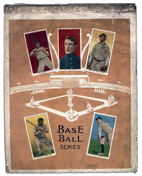
if I was going to have lightening strike me twice, this is how I'd like it to happen. Recently Frank found more examples of E95/96 "cards" glued into a scrapbook:
Of course, there MAY be an exception to the rule. A group of E95 cards was offered on ebay that were on paper stock. They were the same poses used in the E95 set, all were hand cut, a few had parts of a black line showing (see upper left corner of image below) suggesting the were part of a larger piece and meant to be cut out or just given borders for artistic reasons. Note the "card" areas on the above pieces have no such black border, all of the text match what you would find on E95 cards except for one. The change of border treatment suggest maybe is item below didn't come from the same series as above but some type a promotional piece, maybe a poster or advertising card.
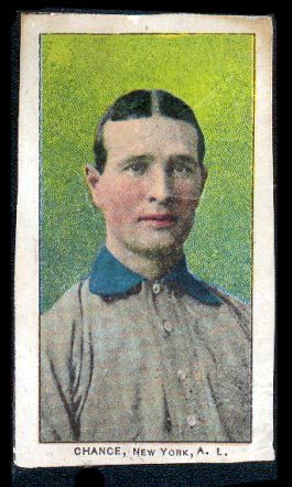
As you can see the team name on this card is New York, A.L. In the E95 set the team assigned to Frank Chance is Chicago. Frank Chance did play for NY, AL late in his career suggesting this "Card" was created some years after the E95 set was issued.
Is it a proof?
Some poses/art used in the E90-1 American Caramel set does appear in other sets but NOT other American Caramel sets. It is possible this item was created to be issued in a set of cards. If it was, it would be the first instance where a candy company reissued it's own art work. Poses used for multiple sets in the e-world is common. But there are no examples of the same pose/art being used by the same company twice. Assuming there are a series of covers, these would be the only examples of art used for a caramel card used twice by same company.
Since the title of the notebook cover says "Base Ball Series" and the space between the "cards" in the second image is the same color as the first I am assuming there were just that - a series of covers made using art from the Philadelphia Caramel sets. If these were issued in the years after the cards were issued it is possible the rights to the art was less expensive but the time was taken to make team updates.
It is also possible the Philadelphia Caramel company created some type of promotional piece for a new series of cards and these "cards" were part of larger piece. They updated the team but notice the "New York," type is on an angle suggesting a very hasty switch or a "just fix it for now" approach meaning to correct it later. Believe me, being in the graphics industry, I know this is done a lot to get items approved for production or to sell a sales campaign.
This item is in the collection of Bob Marquette.
"Tbob" to all his collecting friends.

